Labels
- Assessment (9)
- Evaluation (8)
- Planning (20)
- Preliminary Task (2)
- Research (36)
- Research and Planning (5)
Tuesday, 13 December 2011
Monday, 7 November 2011
Tuesday, 1 November 2011
Music Video - Track Permission Letter (GEMMA FLINDERS)

Above is an image of the email we sent to the record label to use one of their artists' song, Ellie Goulding 'Your Biggest Mistake'.
Monday, 31 October 2011
Sunday, 16 October 2011
Planning posts - checking your progress Oct 16th SJA
WWW:
- Emma, I genuinely really enjoy looking over your blog and seeing your brilliant ideas for the posts.
- I thought your idea for the 'Initial Ideas' and the 'Concept' was really creative and imaginative - keep up this sort of appraoch for each post. These two were really excellent, and your genuine interest in this task really shines Emma!
- Your 'technical tutorials' post was really comprehensive and really showed careful thinking about how you could use the green screen in your own work. You are really developing a high level of technical competence in Media Studies Emma.
EBI:- There's nothing in particular Emma that you need to improve here with what I have seen so far. Just keep going as you are!
Overall assessment of 'Planning' so far: Excellent.To reach the top of Level 4 (which is what you are certainly aiming for) you need to continue to show your excellent grasp of creativity, innovation, imagination and ICT technical flair for every post. The 'Planning' section of your blog really should provide you with loads of opportunities to demonstrate all of these things. Well done so far Emma. Your hard work on this will certainly pay off. You and your group have selected a great track from a really interesting artist, and it should give you lots to experiment with in terms of mise-en-scene and representation. I am really looking forward to seeing what your group comes up with.
Tuesday, 11 October 2011
Advertisement Cover Draft - Photoshop
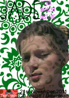 This is my first draft of an advertisment advert for my artist in a magazine. As before, I used the same font as the draft CD cover, as I believe this gives the artist her own brand identity and allows her to have her own logo within the music industry. Also, the font being in capitals makes the name stand out and almost draws in the audience to look at the advert.
 The image used is a close-up of the artist and I feel that this shows her true emotions and facial expressions. Also, the artist looking away emphasises that the artist is wary about the music she produces, yet her calm facial expression suggests that she is passionate about the music she makes.
There is extra information on the advert, like the record label of the artist and when the album is realesed, this helps the audience to know when the album is out and who produced, maybe making them look at more artists by the record label and buying other albums.
However, when it comes to the real advert, I will use another image of the peformer presenting them more as a passionate artist, yet looking wary of the audience who may listen to the music. Also, I will be making sure that the advert, CD cover and music video all link as it will create a brand identity much more easily.
CD Cover Draft - Photoshop
First Draft:
Firstly, for this CD cover I chose to use a close up of the artist but her facial expression shows that she is hiding away from the viewer, reinforced by her looking away from the camera. I then used the smudged tool to make the outline and facial features more smooth and I also brightened her lips. I then faded the image, maybe to protray that she is wary of her the viewer but the close-up shows she is proud of her music. For the background I used a flower pattern and this links to my genre, as it emphasizes the quirkiness of the artist and to make it link more I changed the colour to a bright pink to make it stand out. Further on, I feel the font plays an important role on the CD cover, as it emphasizes that the cover is for an Indie-Pop genre, as even though the font is basic and simple, I believe that the 'A' and 'E' not being fully complete makes the album cover more retro and different, making it stand out more. Also, the font is in white and this represents that the artist pure and that her music real, and that she has a lot of passion for the music she produces.
Second Draft:
In my second draft, I wanted to create a colour scheme within the cover, which can reflected through the advertisment and digipack. I chose the colours of green and purple as I believe the colours represent the artist, because the green/purple almost creates a calm atmosphere and suggests that the artist is passionate about their music. Also, the use of the close-up helps the viewer see the persons' emotions, and the facial expression of her looking away and the image positioned in the right hand corner reinforces the idea that the artist is wary/nervous about presenting their music to the viewer, emphasising that the artist is attached to the music they produce. Further on, I used the same font as before as I feel it really links to my chosen genre and makes the artist have their own personal identity through the use of font. The font again emphasizes the genre of Indie-Pop, as the font is basic and simple, and I believe that the 'A' and 'E' not being fully complete makes the album cover more retro and different, making it stand out more. Also, the artist name is larger than the album name as I feel that the viewer would be more drawn into the actual singer not the album name.
Assessment 10th October JIN
Emma,
Post 15? I can't se a Clear post on the conventions of your Genre with some nice detail on key elements.
I see that one of the theory posts is missing. Can you get Jade onto this if it is her responsibility?
For you to get a really high coursework grade we need to see:
Lots of images posted in innovative ways
Detailed analysis using connotation and lots of Media Langauge.
I know you can continue to do this Emma
Overall your progress is VERY GOOD. Lets get to Excellent! JIN
Monday, 10 October 2011
Music Video - Location Shots
The first location is of a street, and I feel that this will work well with the performer riding bike as it shows her in a natural, humble location performing to the camera. However, the performer will be brightly dressed and will stand out from her surroundings. Also, some of the bike riding will occur in a park and while the performer is riding the bike, there will be a release of balloons, making the video more quirky and linking to our chosen genre. Also, in the location of the park the performer will be walking along a river and just performing the song naturally, and doing what she feels.
Another location is PDH, and this is where most of the "studio" based shots will be filmed, as I want to create a false, crazy atmosphere where the artist is just performing and going crazy. As in this area there will be many close-ups, mid-shots and long-shots of the performer in a spotlight and she'll be seen throwing around powder paint, and will consist of lip-synching.
Also in this area, I plan to use a microphone with a single spotlight on the performer, but will use a different colour light like red to link with my genre more. Also, with the fairy lights we are planning to use high-angle shots and low-angle shots to vary the shot types within my groups music video. Moreover, in the fariy light shots, some will go from focused to blurred to give more of an atmosphere, while trying to effect the audience in some way.
Music Video - Costumes, Make-up & Props
One of my groups main props is the use of a bike with a basket, that looks old-fashioned. However, none of my group had access to a bike so we sent round an email to the whole and we had a few replies, but there was one perfect email from a boy. Below is images of the emails that we had sent.
Music Video - Shooting Schedule
Above is the shooting schedule plan for when and where my group will be filming, and what equipment will be needed.
Music Video - Storyboard (JADE EMANS)
Above is a short video of my groups storyboard and shows each shot, and what will occur in the music video.
Music Video - Concept
Above is a video of me explaining the concept of my music video. It mainly involves the use of arty objects like glitter and paint, as I feel this links well to my theme of Indie-Pop as the artists are seen as being random and quirky. Also, I suggested that the main locations would be an empty room where random scenes can happen, e.g. throwing of paint and a busy street where the viewer can see the artist performing as care-free and natural.
What makes a good Publicity Photo?
Very artist, no matter what genre they are, will have a publicity photo to promote their music, but there is always a certain checklist that they follow:
- Colour Scheme
- Body Language/Posture
- Lighting
- Facial Expressions
- Composition
- Shot type/angle
- Promoting brand image
- Mise-en-scene (Location, costumes & props)
- Editing
- Conventions of genre
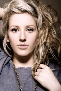 Body Language/Posture:
This plays a major role in the success of presenting an artist in a publicity photo, like if an artist comes across shy and laidback they would stand in a certain way and use a certain facial expression to show this. However, if an artist wants to portray them selves as being powerful, they would stand a certain way like holding a strong posture showing the audience that they are strong and powerful. Conventional body language/posture helps show a certain genre in the music industry, for example in my chosen genre of Indie-Pop, the females portray themselves as shy by looking away from the camera and usual holding their hands to their chests, suggesting that they’re passionate about the music they produce.
 Lighting:
The lighting in a publicity photo helps present an artist, for instances dark lighting is used to hide certain parts of the person in the image, the parts that are hidden can be seen as imperfect or the bright lighting can emphasis an artists perfect feature making the audience more interested in looking at the photo. Although, lighting can present different genres like pop music is bright and bold lighting, whereas rock uses dark lighting.
Shot type/angle:
This convention helps present the artists’ personality, for example a low angle shot is usually used to show that an artist is powerful or successful within the music industry. Whereas, a close-up or high angle shot presents the artist as vulnerable, allowing the shot types to show a certain genre.
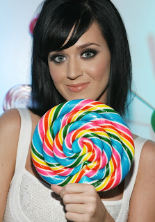 Mise-en-scene:
This is the most important factor in creating a successful publicity photo. Firstly, the use of costume helps portray an artist and their genre, for example gold bling and baggy jeans present the genre of hip-hop, whereas women in short dresses and high heels show the genre of pop. However, costume can be used to hide the imperfections of an artist, for example Lady GaGa isn’t a very beautiful women so her wearing crazy outfits draws the audience away from her imperfections but to the costume she is wearing. Also, props can be used in a publicity photo, this helps emphasise a certain genre or artist, for example Katy Perry is associated with lollypops and candy reinforcing the genre of girly-pop. Lastly, location helps with a publicity photo, most are photo-shoot based but some do have different locations, like the use of a green screen, or a field, emphasising a certain genre.
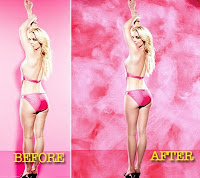 Editing:
Most publicity photos nowadays are photoshopped to show the viewer that everyone is perfect, and that slim, smooth skin is perfect and that everyone should be like that. Also, some things are edited into the photos to make them look more fun, for example Justin Beiber had a background that was brightly coloured and looked like shapes of cartoons, showing that he was from the pop genre.
My Publicity Photo's:
- Colour Scheme
- Body Language/Posture
- Lighting
- Facial Expressions
- Composition
- Shot type/angle
- Promoting brand image
- Mise-en-scene (Location, costumes & props)
- Editing
- Conventions of genre
 Body Language/Posture:
This plays a major role in the success of presenting an artist in a publicity photo, like if an artist comes across shy and laidback they would stand in a certain way and use a certain facial expression to show this. However, if an artist wants to portray them selves as being powerful, they would stand a certain way like holding a strong posture showing the audience that they are strong and powerful. Conventional body language/posture helps show a certain genre in the music industry, for example in my chosen genre of Indie-Pop, the females portray themselves as shy by looking away from the camera and usual holding their hands to their chests, suggesting that they’re passionate about the music they produce.
 Lighting:
The lighting in a publicity photo helps present an artist, for instances dark lighting is used to hide certain parts of the person in the image, the parts that are hidden can be seen as imperfect or the bright lighting can emphasis an artists perfect feature making the audience more interested in looking at the photo. Although, lighting can present different genres like pop music is bright and bold lighting, whereas rock uses dark lighting.
Shot type/angle:
This convention helps present the artists’ personality, for example a low angle shot is usually used to show that an artist is powerful or successful within the music industry. Whereas, a close-up or high angle shot presents the artist as vulnerable, allowing the shot types to show a certain genre.
 Mise-en-scene:
This is the most important factor in creating a successful publicity photo. Firstly, the use of costume helps portray an artist and their genre, for example gold bling and baggy jeans present the genre of hip-hop, whereas women in short dresses and high heels show the genre of pop. However, costume can be used to hide the imperfections of an artist, for example Lady GaGa isn’t a very beautiful women so her wearing crazy outfits draws the audience away from her imperfections but to the costume she is wearing. Also, props can be used in a publicity photo, this helps emphasise a certain genre or artist, for example Katy Perry is associated with lollypops and candy reinforcing the genre of girly-pop. Lastly, location helps with a publicity photo, most are photo-shoot based but some do have different locations, like the use of a green screen, or a field, emphasising a certain genre.
 Editing:
Most publicity photos nowadays are photoshopped to show the viewer that everyone is perfect, and that slim, smooth skin is perfect and that everyone should be like that. Also, some things are edited into the photos to make them look more fun, for example Justin Beiber had a background that was brightly coloured and looked like shapes of cartoons, showing that he was from the pop genre.
My Publicity Photo's:
Music Video - Technical Tutorials
Below is the Final Practice Green-screen:
Images showing the process of producing the Practice Green-screen:
For the film we had to set up a green-screen, and used different cameras at different levels to capture the performance within the frames. From this I had learnt that, green-screen is actually a lot easier to use than expected and that I would need to film the whole performance with different shot types and angles to make the cinematography more exciting. In addition, I believe that my group could use the green-screen to make our video more interesting and different.
To edit the green-screen I used the program Final Cut, and to get rid of the green-screen you use the Chroma Key and you do that by dragging it onto the clip. Then you place the image you want to use on the clip and move the points to get rid on the green. My group would use the green-screen to present the performer as random/quirky linking to my chosen genre of Indie-Pop, almost placing the performer in a weird location performing in a very glamorous way. I have learnt that the editing to get rid of the green-screen does take time, so if we do use it, it'll only be for a short amount of time.
Music Video - Song Details
The song we have chosen the produce a music video too is Ellie Goulding's Your Biggest Mistakes. We have decided to use this song as we like how it starts off slow then builds up into a strong beat, making me personally feel more positive and putting me in a good mood, and this is slightly different to other songs within our genre.
The song is in the genre of Indie-Pop, our chosen genre, and I feel this song allows us to be experimental with the mise-en-scene, like the upbeat tune lets use bright, bold costumes allowing us to make the artist be an individual. The song also has a strong beat and the lyrics seem to link to how she is feeling, presenting the artist as an independent woman.
Tuesday, 4 October 2011
Music Video - Roles
Above is a video presenting my groups job roles.
My specific job role involves me focusing on the lighting for our music, getting the right lighting that goes with the genre and the certain song choice. I am also a camera person, shooting shots throughout the music video and I am also in charge of costumes, making sure that the performer has their right clothing at the right time of filming. Lastly, I am also editing the music video along with the others in my group.
Music Video - Initial Ideas
Above is a video of my groups initial ideas presented in a spider diagram, the information shows what we first thought, what we wanted to see in our music video.
Monday, 3 October 2011
Assessment 2nd October (Research)
Emma,
WWW:
You have really listened and attempted to be creative with your blog posts- well done. This is very effective.
Your audience research is excellent- good use of survey monkey and clips of a focus group.
You've maintained your level of analysis which is detailed.
EBI:
Have you done a post on the conventions of your selected genre?Post 15.
Overall a very good effort- please continue to keep up to date with the homework and complete all those posts.
JIN
Saturday, 1 October 2011
Theory - Bordwell & Thompson (GEMMA FLINDERS)
Graphic
The transitions between each shot can be linked though the same ‘pictorial qualities’ like shape, patterns, and movement of light and can also cause abrupt cuts when contrasting qualities are used.
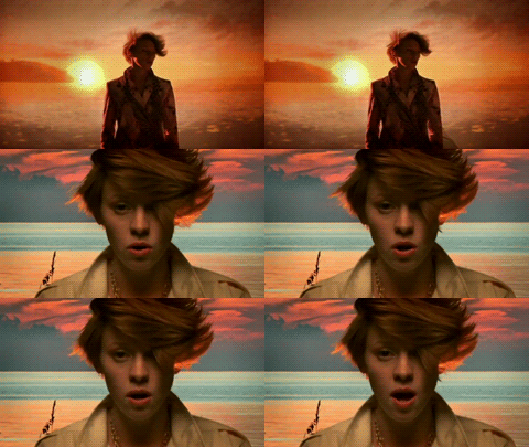 Graphic Match: this cut emphasises the relationship between the graphic similarities of the shots.
Graphic Continuity: this is when there centre of interest stays the same which helps establish a sense of continuity (and sometimes narrative).
Graphic Discontinuity: this is when contrasting colours and shapes are used in the following shot.
Spatial
This transition is how each shot relates to each other through its setting and location.
Continuity Editing: usually an establishing shot followed by a range of small range shots that are shown to be in the same location and time frame.
Kuleshoveffect: here there is no establishing shot but the audience assumes that it is the same time and location.
Cross Cutting: this is where separate places are being shown parallel to each other. Usually shows what is happening at different locations during the same time frame.
Temporal
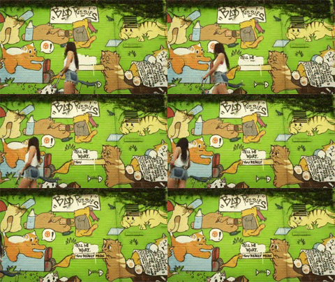 This is when the time of the action in manipulated. It is usually done through flashbacks or flash forwards and can be used to create or answer questions. Ellipsis in time are often used which removes any boring activities which the audience would just assume they have done.
Empty frames: this shows the figure of interest moving out of the frame followed by them walking into an empty frame usually in a different location.
Cutaway: this shows a shot for a small amount of time of an event happening elsewhere.
Rhythmic
This is the duration of each shot in relation to the beat or tempo. It can create tension when the length is steadily increasing or excitement when it is becoming shorter. When a shot is cut on the beat it creates a smooth flow and when it is cut off the beat it usually feels abrupt and incomplete.
Thursday, 29 September 2011
Theory - Andrew Goodwin
Goodwin produced a book called ‘Dancing in the Distraction Factory’ where he stated that the editing style is focused on three areas:
- Illustration
- Amplification
- Disjuncture
- Disjuncture
But it’s further split into the areas of looking at the lyrics, music and image of a band or artist.
Illustration.
Music – The shots always cut on the beat.
Lyrics – The images illustrate the literal meaning or feeling of the lyrics, mainly just with the band singing and dancing.
Band Image - The band simply singing/dancing/playing instruments, usually dressed as would be expected to the genre.
"As you can see, artist Little Boots, from my genre is showing the style of illustration. Her image is basic and would be expected, also she is keeping it simple by playing an instrument she is confident with. Lastly, the shots are cut on the beat of the music".
Amplification.
Music – Shots cut on and off the beat, to emphasise certain features.
Lyrics – The images amplify the lyrics & create a specific narrative, could be used as certain things aren’t picked up from just reading the lyrics. Band Image – The band could take on fictional roles in the narrative.
"Ellie Goulding's Lights, shows Goodwin's theory of Amplification as there is the shot of the close-up, which is in slow motion and doesn't cut on the beat. Also, the viewer wouldn't expect Ellie to be so glamorous, taking on a fictional role, but still linked to her expected look for the genre".
Disjuncture.
Music – Shots cut off the beat, can be a sign of a badly made music video, (but not always).
Lyrics – The images don’t relate to the lyrics that are used, sometimes used by bands who are already very well established, and who can afford to take the risk.
Disjuncture.
Music – Shots cut off the beat, can be a sign of a badly made music video, (but not always).
Band Image – The band/artist takes on an image that’s completely opposite of their expected image, e.g. Katy Perry in TGIF.
"Florence shows Goodwin's, disjuncture really well, because most of the shots are cut off the beat, as she is really well-known. Also, the audience wouldn't expect Florence to be dancing and have lots of make-up on, showing the complete opposite".
"Florence shows Goodwin's, disjuncture really well, because most of the shots are cut off the beat, as she is really well-known. Also, the audience wouldn't expect Florence to be dancing and have lots of make-up on, showing the complete opposite".
Wednesday, 28 September 2011
Questionnaire - Florence & the Machine
In my group we created a short video of a few people watching, Florence & the Machines' Dog Days, and we then asked a few questions related to our genre of indie-pop and we'll use this to help create our own music video.
Monday, 26 September 2011
Questionnaire Results - Survey Monkey
The graphs and pie charts below show the results from the survey website 'Survey Monkey', and I received a range of answers from the people that will help towards creating my music video. Here are some of the results:
Within the results it shows that more than ¾ of people who took the survey, watch music videos more than a couple of times a week, showing that people nowadays watch music videos and want too see how the artist could perform the certain song. This research will help, as it makes my group realise that music videos are largely popular and that we need to make our video attractive.
The pie chart above shows that just over a ¼ of people listen to rock music and that nearly a ¼ listen to pop music. This indicates that these genres of music are the most popular and that the people are more inclined to watch them music videos.
Over half of the people from this question didn’t care who performed in a ‘Pop’ music video, but preferred was a female artist, which helps towards choosing a performer for my music video.
With our genre, Indie-Pop, as a group we felt that fashion played an important role to the artist and the music video, so we asked a question based on this to see what people thought. From most of the comments it shows that people felt that fashion was important to the artist, as many felt it made the artist an individual and more recognisable. This helps us as we will have to focus on the fashion/costume in the video to reach the audience.
Music Industry Questionnaire - Survey Monkey
For research into creating my music video, I created a survey using a survey website to reach my audience and ask them question what genre's of music they like and what locations they preferred, etc. Below is a screen grab of some of the survey but I have also attached the link to the survey.
http://www.surveymonkey.com/s/XFWPCZ8
http://www.surveymonkey.com/s/XFWPCZ8
Saturday, 24 September 2011
Analysis of Chosen Genre - Advertisement (GEMMA FLINDERS)
Florence and the Machine-Lungs.
The main image of this advert is of the artist and this takes up the majority of it. This image is the same of as the it is advertising which allows the audience to become familiar with it and if they see it in a shop they may be more likely to buy it. The image it self shows the artist (who is a young, white, female) looking to her left and and down. I feel by doing this she gives a calm feel to the advert/cover which also follows the conventions of indie. As the artist is the main image on this advert it allows people who recognise her to be able to know what it is advertising but also allows people who do not know her to be able to become familiar with her in eventually be able to recognise her as this is an advert for the artist herself and the album. The background of the image being flowers, the green top gives of a natural tone to the advert but is contraindicated with the black nail varnish and her make up. The advert in split into three (the name of the artist, the image of the artist, and the information) this is affective as it follows the rule of thirds and makes it appealing to the eye.
The lungs that are visible links with the album name and due to it being different more people may look at it but it also suggest that the artist has her own style. The costume she is wearing is loose around her arms which I think makes it look slightly like she has wings, this links with the theme of natural that is evident in the image. The image of the artist is a mid-shot which suggest that she is more recognisable by her face and hair then by her body, this is a convention of the indie genre and the artist a are recognised for their talent which comes from the upper parts of their body including their lungs (which is exaggerated here) and more often the heart (which shows their passion for the music they create).
The information shown on the advert includes all the typical things an advert should. This includes the record label (at the bottom right). The name of the album 'lungs' is just below the main image which with make putting automatically look at it after they have looked at the image. The album name is a italic, serif font which makes it look more formal and I think professional. 'Lungs' is also the biggest text on the page with each letter in capitals and slightly spread out which makes it not only easy to read but also the first thing you read as well. All the text on this advert is white against a black background which makes it easy to read and also makes the text stand out. The rest of the information (minus the name of the artist) is in the same font as the album name but it is not in italics. This allows the audience to link the pieces of information together but still understand that the album name is the more important but of information. The bits of information at the bottom is all different sizes which suggest that different things are more important for the audience to know. There is also a website at the bottom which also gives of a professional vibe to it.
The name of the artist is in a different font to the rest of the album which makes it stand out from the rest. The font that is used for it is the same font the artist always uses when referring herself. It is still the same colour as the rest of the text which links them all together. All the text is centrally aligned which creates a balance and equal feel to the advert.
I think the overall advert is very effective as it follows the conventions of the correct genre whilst providing all the relevant information.
Analysis of Chosen Genre - CD Cover (GEMMA FLINDERS)
This album La Roux by the duo of the same name has a very effective album cover. This is the first proper album by from La Roux therefore the close up of the main artists face helps to sell the album whilst promoting La Roux. Her hair is quite iconic and she is often recognised through it which is probably why her hair takes up a large proportion of the cover. I think the fact that she does not have any heavy eye make up on and a very natural colour on her lips is successful as it contrast with how she looks slightly fake which I think gives an unusual feel to the cover. The red background links with her hair as well as the style of the artist. Also red usually connotes passion which is a convention of this genre as the artists is usually shown to be passionate about their music.
The artist is looking away from the camera with a slight emotionless expression which could represent her individuality and independence. As the only thing apart from the text is the artists face it makes sure that the audience focuses on her and nothing else which is effective. The only text is the album/artist's name which is at the top of the cover. It is written in the font that La Roux uses for all their products which allows an audience to become familiar with it and recognise it easier making it more likely they would buy another of their products if they liked one. La Roux is written in white which stands out against the red and makes it eye catching and easy to read.
Mood Board of Chosen Genre - Video
Above is a mood board in the form of a video showing artists from my genre of Indie-Pop, and I have used a variation of shots, from publicity photos to music videos. All the artists in the genre of Indie-Pop are female, and when presented in photos their styles come across as quriky and almost stand-out from other female artists. Also, they aren't as powerful than other female artists, but they mainly focus on the music they produce. However, although style doesn't seem to matter to them, they are represented to the audience as being fashionable with an edge.
Monday, 19 September 2011
Chosen Genre Analysis - La Roux "Quicksand" (GEMMA FLINDERS)
The actual shots throughout this video are fairly simple and then the things that make this video interesting are adding in post-production. The shots mainly consist of close-ups of the artist face as she lip syncs the song, this is a convention of this genre which focuses more on the artists individuality and talent than their body and sex appeal.
The main colour scheme is purple and oranges due to the sunset backdrop in the background which. The colour and beach location makes the video seem exotic and tropical which suggest that it is some sort of holiday which give of a relaxing feel which is a convention of this genre.
The dark lighting of the artist in the foreground which contrast with the brighter background creates sort of silhouette of the artist which is effective when she turns her head to the side as you can see the outline of her hair which is how she is usually recognised.
This video also has many fade transitions which cause the clips to overlap creating a surreal tone. This is also exaggerated with the effects that have been editing in and the fake overtone to the video which is created using green screens. The costumes is quite unusual which adds to the individuality of the artist however in this video her make up seems quite natural and not as heavy compared to her other videos which adds to the calmness and natural feel.
This music video very much feels like a promotional video for the artist. This is due to amount of screen time she get and the majority of the shots being close ups. Due to the video being quite simplistic and the lack of a narrative the audience can focus on the artist and become familiar with what she looks like and her style. The lighting adds to her image as in some shots you can not see her clearly which adds mystery and poses questions to who she is and may want to audience to find more out about La Roux.
Chosen Genre Analysis - Florence & The Machine "Rabbit Heart" (GEMMA FLINDERS)
This music video follows many of the typical features of our chosen genre whist also using features that the artist usually uses in most of her videos. Throughout the video the main type of shots are close ups which so the artist face which take up most of the frame showing her singing whilst looking passionate about her music. Being passionate about their music is a convention of this genre, also stereotypically the artists have their own unique style and Florence is no exception. The close ups on her face last quite a long time and are sometimes followed by a very slow fade into the next shot which causes the two shots to be overlapping creating a surreal feel to the video. It feels surreal as the audience is viewing two scenes together so the audience has to concentrate on what is happening. As close ups are used throughout the video it ensures that she is the main focus through out and that the audience should be watching her. This is also exaggerated through tracking shots that follow her while she is dancing and singing.
The props and costumes create what I believe to be a fairytale tone to the video. This is due to the pale colours (cream and green). The females in the video are all wearing frilly dresses that flow as they dance while the males are wearing top hats, and some form of uniform or suit. The choice of costume I think is quite unusual for this genre as the female artist stereotypically portrays herself to be a strong and independent woman and the choice of clothing creates a vulnerable feel towards the artist and the other females while the men seem stronger due to their costume. These costumes seem quite old fashioned and give of a slight hippy feeling and also suggest some sort of ceremony is taking place as they are a smart choice of costume. The artist is usually recognised due to her bright hair, and the soft and neutral colour scheme allows her hair to stand out.
The lighting throughout the video creates a very calm and peaceful feel to the video which contrasts with the sacrifice shown at the end which I think is effective. The lighting seems to be quite bright however it is very soft which adds to the fairytale and surreal feel to the video. I think the lighting is a big element that makes this video successful as they are effective is telling the story of what is happening in the video and how the audience should feel throughout it.
Chosen Genre Analysis - Little Boots "Remedy" (JADE EMANS)
Little Boots 'Remedy' music video is very similar to Ellie Goulding's 'Lights' which goes to show that the conventions seen in both of these are quite popular when it comes to creating a electro pop music video. The mise en scene is very similar, she appears in the same sort of location in a black room which is lit by bright lights. The lights in the previous video were multicoloured however these are white and gold giving off the impression that she is quite pure and innocent however they also bring a star-like, glamourous atmosphere.
Throughout this video Little Boots remains in one costume however due to the fact that it is quite busy viewer fatigue is not a problem. The costume that she is in is interesting and slightly outrageous as it is not something you would see in high street fashion, this is effective as it makes the video exciting and unique. She is also seen playing the key board, which takes plays a major part in electro pop music. I think that showing an artist playing an instrument in their music video portrays their talent and skills making them a good role model to people that listen to their music and play instruments themselves. The use of smoke in this video creates an eeire, darker atmosphere however it also looks like a futuristic extra terrestrial scene.
The cinematography in this video portrays her as being vulnerable rather than powerful. The use of birds eye view shots look as if she is weaker however I think it also brings out a softer side to her strong image. It could also portray sex appeal as she is layed out on the floor in a slightly suggestive and provocative manor which would attract the male side of the audience. Although the high shot portrays a vulnerable look the fact that there is more than one of her could connote power and her growing success in the music industry. I like the close up that has been used on her eye, I think it brings a more serious tone to the video. The way in which her eye is looking into the camera gives a threatening feel, portraying she is not as innocent as it seems.
The editing plays a major part in this video, the screen grab shown above is a very creative the effect has multipyed the amount of mouths which may be putting emphasis on the fact that she is a talented singer. I think it is an effective shot to use when promoting the electro/indie pop genre as it is quite unusual and quirky, also interesting to look at.
Subscribe to:
Comments (Atom)


