Labels
- Assessment (9)
- Evaluation (8)
- Planning (20)
- Preliminary Task (2)
- Research (36)
- Research and Planning (5)
Showing posts with label Planning. Show all posts
Tuesday, 1 November 2011
Music Video - Track Permission Letter (GEMMA FLINDERS)
Above is an image of the email we sent to the record label to use one of their artists' song, Ellie Goulding 'Your Biggest Mistake'.
Monday, 31 October 2011
Tuesday, 11 October 2011
Advertisement Cover Draft - Photoshop
This is my first draft of an advertisment advert for my artist in a magazine. As before, I used the same font as the draft CD cover, as I believe this gives the artist her own brand identity and allows her to have her own logo within the music industry. Also, the font being in capitals makes the name stand out and almost draws in the audience to look at the advert. The image used is a close-up of the artist and I feel that this shows her true emotions and facial expressions. Also, the artist looking away emphasises that the artist is wary about the music she produces, yet her calm facial expression suggests that she is passionate about the music she makes.
There is extra information on the advert, like the record label of the artist and when the album is realesed, this helps the audience to know when the album is out and who produced, maybe making them look at more artists by the record label and buying other albums.
However, when it comes to the real advert, I will use another image of the peformer presenting them more as a passionate artist, yet looking wary of the audience who may listen to the music. Also, I will be making sure that the advert, CD cover and music video all link as it will create a brand identity much more easily.
CD Cover Draft - Photoshop
First Draft:
Firstly, for this CD cover I chose to use a close up of the artist but her facial expression shows that she is hiding away from the viewer, reinforced by her looking away from the camera. I then used the smudged tool to make the outline and facial features more smooth and I also brightened her lips. I then faded the image, maybe to protray that she is wary of her the viewer but the close-up shows she is proud of her music. For the background I used a flower pattern and this links to my genre, as it emphasizes the quirkiness of the artist and to make it link more I changed the colour to a bright pink to make it stand out. Further on, I feel the font plays an important role on the CD cover, as it emphasizes that the cover is for an Indie-Pop genre, as even though the font is basic and simple, I believe that the 'A' and 'E' not being fully complete makes the album cover more retro and different, making it stand out more. Also, the font is in white and this represents that the artist pure and that her music real, and that she has a lot of passion for the music she produces.
Second Draft:
In my second draft, I wanted to create a colour scheme within the cover, which can reflected through the advertisment and digipack. I chose the colours of green and purple as I believe the colours represent the artist, because the green/purple almost creates a calm atmosphere and suggests that the artist is passionate about their music. Also, the use of the close-up helps the viewer see the persons' emotions, and the facial expression of her looking away and the image positioned in the right hand corner reinforces the idea that the artist is wary/nervous about presenting their music to the viewer, emphasising that the artist is attached to the music they produce. Further on, I used the same font as before as I feel it really links to my chosen genre and makes the artist have their own personal identity through the use of font. The font again emphasizes the genre of Indie-Pop, as the font is basic and simple, and I believe that the 'A' and 'E' not being fully complete makes the album cover more retro and different, making it stand out more. Also, the artist name is larger than the album name as I feel that the viewer would be more drawn into the actual singer not the album name.
Monday, 10 October 2011
Music Video - Location Shots
The first location is of a street, and I feel that this will work well with the performer riding bike as it shows her in a natural, humble location performing to the camera. However, the performer will be brightly dressed and will stand out from her surroundings. Also, some of the bike riding will occur in a park and while the performer is riding the bike, there will be a release of balloons, making the video more quirky and linking to our chosen genre. Also, in the location of the park the performer will be walking along a river and just performing the song naturally, and doing what she feels.
Another location is PDH, and this is where most of the "studio" based shots will be filmed, as I want to create a false, crazy atmosphere where the artist is just performing and going crazy. As in this area there will be many close-ups, mid-shots and long-shots of the performer in a spotlight and she'll be seen throwing around powder paint, and will consist of lip-synching.
Also in this area, I plan to use a microphone with a single spotlight on the performer, but will use a different colour light like red to link with my genre more. Also, with the fairy lights we are planning to use high-angle shots and low-angle shots to vary the shot types within my groups music video. Moreover, in the fariy light shots, some will go from focused to blurred to give more of an atmosphere, while trying to effect the audience in some way.
Music Video - Costumes, Make-up & Props
One of my groups main props is the use of a bike with a basket, that looks old-fashioned. However, none of my group had access to a bike so we sent round an email to the whole and we had a few replies, but there was one perfect email from a boy. Below is images of the emails that we had sent.
Music Video - Shooting Schedule
Above is the shooting schedule plan for when and where my group will be filming, and what equipment will be needed.
Music Video - Storyboard (JADE EMANS)
Above is a short video of my groups storyboard and shows each shot, and what will occur in the music video.
Music Video - Concept
Above is a video of me explaining the concept of my music video. It mainly involves the use of arty objects like glitter and paint, as I feel this links well to my theme of Indie-Pop as the artists are seen as being random and quirky. Also, I suggested that the main locations would be an empty room where random scenes can happen, e.g. throwing of paint and a busy street where the viewer can see the artist performing as care-free and natural.
What makes a good Publicity Photo?
Very artist, no matter what genre they are, will have a publicity photo to promote their music, but there is always a certain checklist that they follow:
- Colour Scheme
- Body Language/Posture
- Lighting
- Facial Expressions
- Composition
- Shot type/angle
- Promoting brand image
- Mise-en-scene (Location, costumes & props)
- Editing
- Conventions of genre
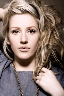
Body Language/Posture:
This plays a major role in the success of presenting an artist in a publicity photo, like if an artist comes across shy and laidback they would stand in a certain way and use a certain facial expression to show this. However, if an artist wants to portray them selves as being powerful, they would stand a certain way like holding a strong posture showing the audience that they are strong and powerful. Conventional body language/posture helps show a certain genre in the music industry, for example in my chosen genre of Indie-Pop, the females portray themselves as shy by looking away from the camera and usual holding their hands to their chests, suggesting that they’re passionate about the music they produce.
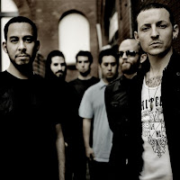
Lighting:
The lighting in a publicity photo helps present an artist, for instances dark lighting is used to hide certain parts of the person in the image, the parts that are hidden can be seen as imperfect or the bright lighting can emphasis an artists perfect feature making the audience more interested in looking at the photo. Although, lighting can present different genres like pop music is bright and bold lighting, whereas rock uses dark lighting.
Shot type/angle:
This convention helps present the artists’ personality, for example a low angle shot is usually used to show that an artist is powerful or successful within the music industry. Whereas, a close-up or high angle shot presents the artist as vulnerable, allowing the shot types to show a certain genre.
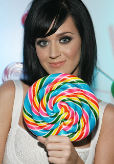
Mise-en-scene:
This is the most important factor in creating a successful publicity photo. Firstly, the use of costume helps portray an artist and their genre, for example gold bling and baggy jeans present the genre of hip-hop, whereas women in short dresses and high heels show the genre of pop. However, costume can be used to hide the imperfections of an artist, for example Lady GaGa isn’t a very beautiful women so her wearing crazy outfits draws the audience away from her imperfections but to the costume she is wearing. Also, props can be used in a publicity photo, this helps emphasise a certain genre or artist, for example Katy Perry is associated with lollypops and candy reinforcing the genre of girly-pop. Lastly, location helps with a publicity photo, most are photo-shoot based but some do have different locations, like the use of a green screen, or a field, emphasising a certain genre.
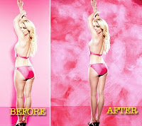
Editing:
Most publicity photos nowadays are photoshopped to show the viewer that everyone is perfect, and that slim, smooth skin is perfect and that everyone should be like that. Also, some things are edited into the photos to make them look more fun, for example Justin Beiber had a background that was brightly coloured and looked like shapes of cartoons, showing that he was from the pop genre.
My Publicity Photo's:
- Colour Scheme
- Body Language/Posture
- Lighting
- Facial Expressions
- Composition
- Shot type/angle
- Promoting brand image
- Mise-en-scene (Location, costumes & props)
- Editing
- Conventions of genre
Body Language/Posture:This plays a major role in the success of presenting an artist in a publicity photo, like if an artist comes across shy and laidback they would stand in a certain way and use a certain facial expression to show this. However, if an artist wants to portray them selves as being powerful, they would stand a certain way like holding a strong posture showing the audience that they are strong and powerful. Conventional body language/posture helps show a certain genre in the music industry, for example in my chosen genre of Indie-Pop, the females portray themselves as shy by looking away from the camera and usual holding their hands to their chests, suggesting that they’re passionate about the music they produce.
Lighting:The lighting in a publicity photo helps present an artist, for instances dark lighting is used to hide certain parts of the person in the image, the parts that are hidden can be seen as imperfect or the bright lighting can emphasis an artists perfect feature making the audience more interested in looking at the photo. Although, lighting can present different genres like pop music is bright and bold lighting, whereas rock uses dark lighting.
Shot type/angle:
This convention helps present the artists’ personality, for example a low angle shot is usually used to show that an artist is powerful or successful within the music industry. Whereas, a close-up or high angle shot presents the artist as vulnerable, allowing the shot types to show a certain genre.
Mise-en-scene:This is the most important factor in creating a successful publicity photo. Firstly, the use of costume helps portray an artist and their genre, for example gold bling and baggy jeans present the genre of hip-hop, whereas women in short dresses and high heels show the genre of pop. However, costume can be used to hide the imperfections of an artist, for example Lady GaGa isn’t a very beautiful women so her wearing crazy outfits draws the audience away from her imperfections but to the costume she is wearing. Also, props can be used in a publicity photo, this helps emphasise a certain genre or artist, for example Katy Perry is associated with lollypops and candy reinforcing the genre of girly-pop. Lastly, location helps with a publicity photo, most are photo-shoot based but some do have different locations, like the use of a green screen, or a field, emphasising a certain genre.
Editing:Most publicity photos nowadays are photoshopped to show the viewer that everyone is perfect, and that slim, smooth skin is perfect and that everyone should be like that. Also, some things are edited into the photos to make them look more fun, for example Justin Beiber had a background that was brightly coloured and looked like shapes of cartoons, showing that he was from the pop genre.
My Publicity Photo's:
Music Video - Technical Tutorials
Below is the Final Practice Green-screen:
Images showing the process of producing the Practice Green-screen:
For the film we had to set up a green-screen, and used different cameras at different levels to capture the performance within the frames. From this I had learnt that, green-screen is actually a lot easier to use than expected and that I would need to film the whole performance with different shot types and angles to make the cinematography more exciting. In addition, I believe that my group could use the green-screen to make our video more interesting and different.
To edit the green-screen I used the program Final Cut, and to get rid of the green-screen you use the Chroma Key and you do that by dragging it onto the clip. Then you place the image you want to use on the clip and move the points to get rid on the green. My group would use the green-screen to present the performer as random/quirky linking to my chosen genre of Indie-Pop, almost placing the performer in a weird location performing in a very glamorous way. I have learnt that the editing to get rid of the green-screen does take time, so if we do use it, it'll only be for a short amount of time.
Music Video - Song Details
The song we have chosen the produce a music video too is Ellie Goulding's Your Biggest Mistakes. We have decided to use this song as we like how it starts off slow then builds up into a strong beat, making me personally feel more positive and putting me in a good mood, and this is slightly different to other songs within our genre.
The song is in the genre of Indie-Pop, our chosen genre, and I feel this song allows us to be experimental with the mise-en-scene, like the upbeat tune lets use bright, bold costumes allowing us to make the artist be an individual. The song also has a strong beat and the lyrics seem to link to how she is feeling, presenting the artist as an independent woman.
Tuesday, 4 October 2011
Music Video - Roles
Above is a video presenting my groups job roles.
My specific job role involves me focusing on the lighting for our music, getting the right lighting that goes with the genre and the certain song choice. I am also a camera person, shooting shots throughout the music video and I am also in charge of costumes, making sure that the performer has their right clothing at the right time of filming. Lastly, I am also editing the music video along with the others in my group.
Music Video - Initial Ideas
Above is a video of my groups initial ideas presented in a spider diagram, the information shows what we first thought, what we wanted to see in our music video.
Subscribe to:
Posts (Atom)


